Principles of Use
Menu
 ART-DECOR Release 3 has a menu bar on the left that groups all Panels and Features into different areas. Dependent of whether the user is anonymous (not logged in), a logged in user or a Project Author, the set of available menu items changes contextually.
The areas for all users are
- the Home area, where users can switch Projects in focus and where basic information about the Server, Services and Software is provided,
- the Project area with overview of the Project and additional features such as Publications, History, Project Index of artefatcs etc.,
- the Dataset area that allows to see Datasets and their details,
- the Scenario area that offers grouped Transactions and their details
- the Terminology area for Value Sets, Code Systems, Mappings and the Terminology Browser
- the Rules area for Templates, Profiles and Associations and
- the Issues area as the ART-DECOR Ticket and Change Management System.
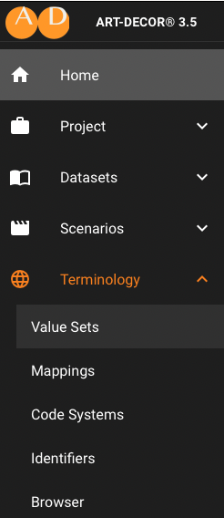
Some of the Menu Items opens as a submenu, such as the Terminology Menu (see right). Clicking on a Menu Item opens the corresponding Panel or offers the associated feature to the right of the screen.
Panels
General Structure
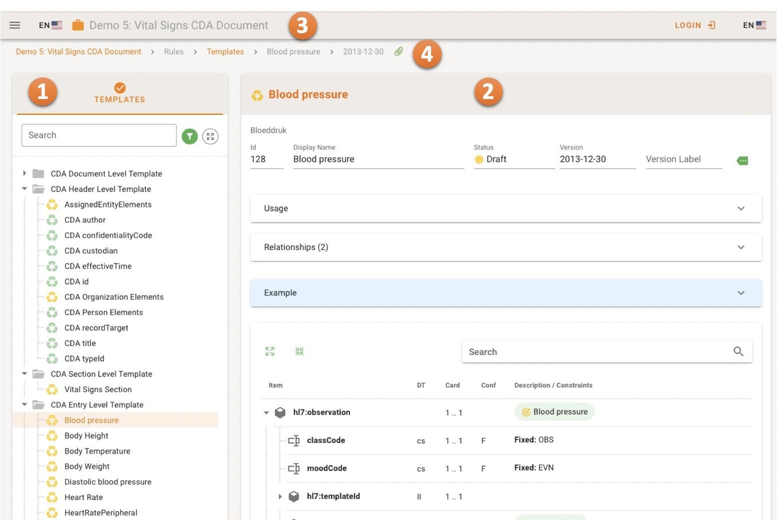
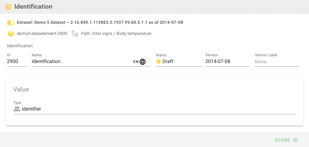
Typically, a Panel in ART-DECOR Release 3 has two areas: the Navigation Tree Card on 1/3 of the screen to the left 1, showing the list of artifacts and a Detail Card occupying around 2/3 of the screen to the right showing details about the artifact 2, that has been selected from the Navigation Tree.
On top there is also a Top Menu strip 3 with Language Switches and a Breadcrumb strip 4 for orientation and deep links.
The following example shows the Template Panel with the Navigation Tree Card offering a grouped overview of all Templates in the Project and the details about the selected Template Blood Pressure. Please note that there is also a Breadcrumb strip and the Top Menu strip with the Language Switches and the name of the selected Project and a Login button or a small submenu with User Preferences if the user is logged in.
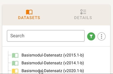
Navigation Tree Cards
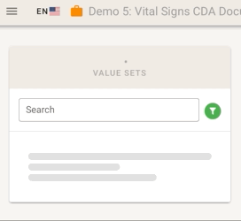
In the figure above 1 shows the Navigation Card that is typical for many Panels. It can be hierarchical such as for Templates or it can be a simple list, e.g. like the one for Value Sets.
Typical Navigation Tree Cards also allow users to filter the items, e.g. by status, to expand a collapsed navigation tree at once, and to search for items (by name, or ID).

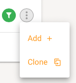
Navigatioon Tree Card also may offer sub menus to manage the artifacts, e.g. adding a new item or cloning an existing one etc.
Detail Cards
The typical Detail Card (see above figure 2) occupies around 2/3 of the screen to the right showing details about the artifact, that has been selected from the Navigation Tree.
List Cards
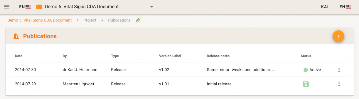
In some cases artifacts are listed populating the whole screen, e.g. for Publications. Typically action menus to the right allow to maintain the items, given that a user has the privileges to do so.
Buttons
Panel Buttons
Normal Panels such as for Datasets or Templates show buttons in different colors. Green buttons just change the view or navigate without changing data.
Data changing action buttons are orange, deleting actions have red buttons.

"Big" Buttons
In all areas for System Administration associated Panels the buttons are bigger (as sys admin actions may include more severe actions).

Speed dials
Some items have a Speed Dial menu to the very right to offer multiple different actions such as deleting or editing the item.

Text Editing
Multilingual Text Editing
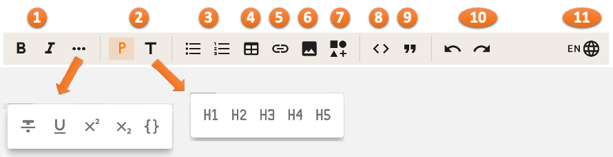
Many places allow Multilingual Text Editing. The editor has a tool bar 1 offers a variety of options for formatting and layout. Multilingual Text Editors allow for switching the language 2. The editor area 3 reflects the rendered text with markup.
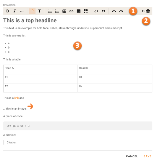
The tool bar offers formatting and modification options.
Font changes 1 boldface, italics, and in a submenu also strike-through, underline, superscript and subscript and monospace / code fragment.
Normal paragraph and headings / title format H1-H5 2, unordered and ordered lists 3, tables 4, links 5 and images (copy&paste and drag&drop) 6.
Insertion of ART-DECOR artifacts references from the current project 7, code areas 8 and citations 9.
Furthermore y undo and a redo cutton 10 and a multi language switch 11.
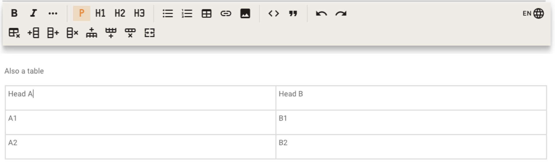
A special part for usual table layout opens as a second row while editing a table.
Keyboard Shortcuts Text Editing
Many formatting options are also availbe as keyboard shortcuts. This is the complete list of ART-DECOR's keyboard hacks for multilingual text fields.
Legenda: ⌘ Command, ⇧ Shift, ⌥ Option / Alt, ⌃ Control / Ctrl
| Command | Windows/Linux | macOS |
|---|---|---|
| Editing | ||
| Copy | Ctrl C | ⌘ C |
| Cut | Ctrl X | ⌘ X |
| Paste | Ctrl V | ⌘ V |
| Undo | Ctrl Z | ⌘ Z |
| Inline Text Style | ||
| Bold | Ctrl B | ⌘ B |
| Italicize | Ctrl I | ⌘ I |
| Underline | Ctrl U | ⌘ U |
| Strikethrough | Ctrl Shift X | ⌘ ⇧ X |
| Code | Ctrl E | ⌘ E |
| Subscript | Ctrl , | ⌃ , |
| Superscript | Ctrl . | ⌃ . |
| Headings and Paragraphs | ||
| Apply normal text style | Ctrl Alt 0 | ⌘ ⌥ 0 |
| Apply heading style 1 | Ctrl Alt 1 | ⌘ ⌥ 1 |
| Apply heading style 2 | Ctrl Alt 2 | ⌘ ⌥ 2 |
| Apply heading style 3 | Ctrl Alt 3 | ⌘ ⌥ 3 |
| Apply heading style 4 | Ctrl Alt 4 | ⌘ ⌥ 4 |
| Apply heading style 5 | Ctrl Alt 5 | ⌘ ⌥ 5 |
| Apply heading style 6 | Ctrl Alt 6 | ⌘ ⌥ 6 |
Languages
The project language changes to the user's preferred language (if available in the project) if:
- A new project is loaded and a user is logged in (even when the page is loaded)
- A user logs in after a project has been selected
- Another preferred language is saved under user settings
Top Menu Strip
The Top Menu Strip allows you to temporarily collapse the big left navigation menu by toggeling this with the Hamburger menu icon at the leftmost position.

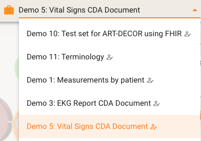
Project selection and Project language
The Project language follows with a language indicating flag. If a Project is selected the project is shown with the Project icon (briefcase) and the name of the project.
One can easily switch to another project by clicking into the Project name in the Top Menu Strip. A select field appears offering you the projects on the server. If you are logged in the list of projects where you are author or constributor of are shown first indicated by a little icon with a person with a pencil, sorted alphabetically. The list ist completed by projects you are not an author or contributor of.
Login / User name
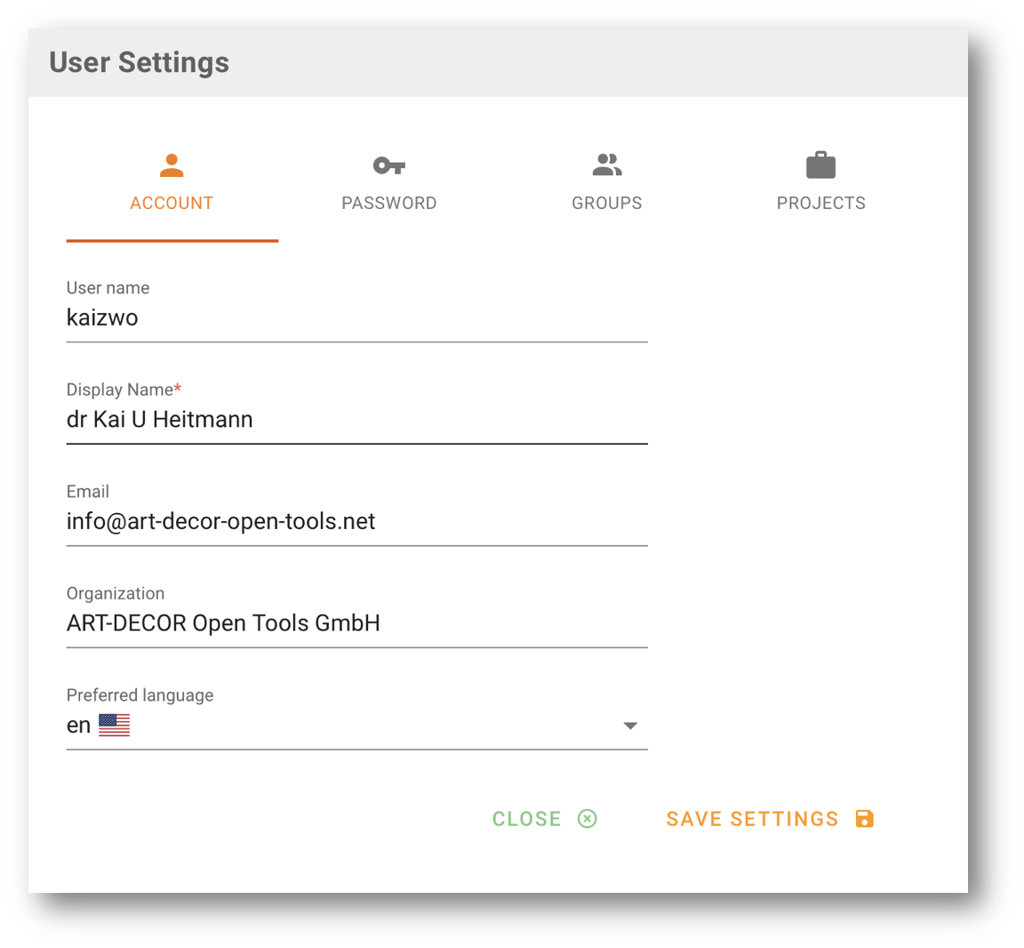
The right part of the Top Strip menu is completed by a login button (in logged out) or the User name otherwise. The User name is a small menu where users can open the User Settings / Preferences dialog to maintain their personal settings.
User Settings / Preferences
The User Settings / Preferences dialog allows to change display name, email or organization and the preferred User Interface Language ("Preferred language"). Don't mix this with the Project Language (the flag next to the Project icon on the left). Clicking on SAVE SETTINGS immediately saves the settings.
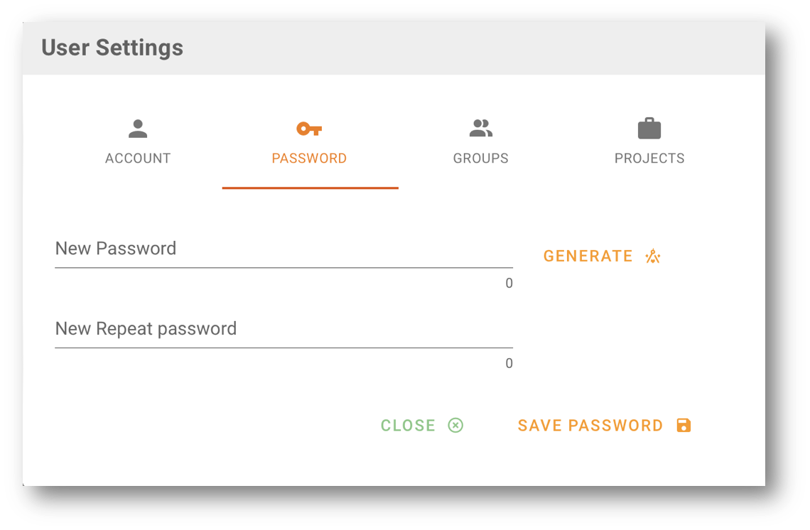
The next tab allows the user to reset his password. He can either enter a password (that must be conformant to the password rules) or let ART-DECOR generate one.
PASSWORD RULES
ART-DECOR forces to comply with the following password rules:
- minimum of 10 characters
- at least one
A-Z - at least one
a-z - at least one digit
0123456789 - at least one special character
!"§$%&/()=?,.-+#
Clicking on SAVE PASSWORD immediately saves the new password.
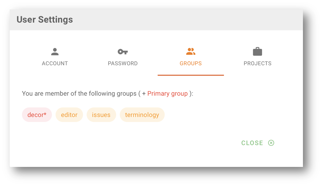
The other tabs allow to see the groups and the list projects the user is an author or contributor of.
A users's settings are always used when the user logs in, however he/she also may temporarily switch the User Interface Language for the session.
Breadcrumbs
Many Panels show breadcrumbs at the top of the main area.
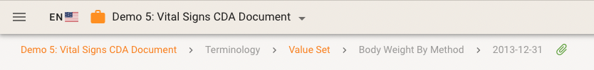
A breadcrumb is mimicing the path in which part the user has navigated to in the app and therefore provides orientation. In the example above the user is looking at a specific Value Set Version in the Terminology area of the Demo 5 project.
Please note that parts of the breadcrumb may be grayed out. Some parts do not add any additional meaning to the actual route to the object. The last part of the breadcrumb is disabled everywhere, it represents the point where you are already at.
There is a paperclip allowing you to copy the deep link to this Panel.
Deep Links
There is a paperclip next to a breadcrumb and some artifact names in Panels which allows you to copy the deep link to this page into your clipboard. Please note that the actual deep link may look differently from what is in the breadcrumb text. For example, the deep link to this issue is
.../aktin-/issues/issues/2.16.840.1.113883.2.6.60.3.6.6
...thus contains project prefix, the path and the full identifier of this issue.
NOTE
You can send deep links to colleagues or team mates, e.g. via email, and they are then able to directly go to that artifact.
Tree Tables
Artifact Reference Details
Artifacts that are linked to another artifact (in a specific context) are typically shown as pills. The pill has one of the typically colors for the artifacts.
As an example, a Scenario Transaction Leaf may have an underlying Source Dataset and a Representing Template Reference. These are show accordingly in the metadata section.

Clicking on the pill opens a slim view on the referenced artifact. In the example below, a Dataset Concept is shown that actually appears in a Template Design Body.
In some cases, as direct option to go to the artifact is offered.

Micro Edits / Block Edits
Icons
tbd
Names
tbd
Hints / Tooltips
tbd
Spinners and Loaders
API Loader
Any time a conversation between front end and back end takes place, the so-called API loader appears in the bottom right corner.

Navigation Tree Card Spinner
When entering Navigation Tree Cards, loading of the tree is indicated by a spinner.
Example: Dataset and Dataset Concepts
Example: Terminology Panel (Value sets)
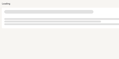
Panel Loader
If a whole Panel is loaded like the Home Panel, a skeleton loader is shown.
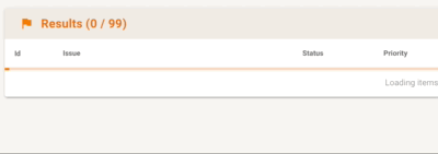
Panel Card Loader
A Panel Card such a data table or a property information card indicate loading by a animated loader bar.
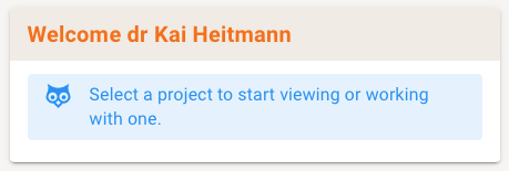
Owl
In certain situations our wise owl may appear in order to give you hints or instructions on how to continue or what to do. The example below is the owl telling you to select a project first, before you can browse it. Next to blue-colored hints or instructions there are also orange (warning) and red (error) owls.
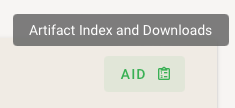
Artifact Inspection and Download (AID)
The green Artifact Inspection and Download (AID) button located at prominent places in panels offers all download and visualization options in context.
There is a dialog shown that offers all options in context, as an example here for Terminology Artifacts:
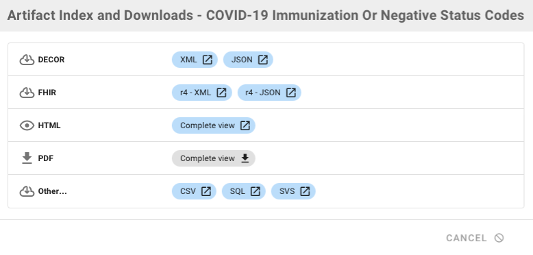
This includes native DECOR format downloads (with the download symbol before the type), native FHIR artifact download (only if FHIR is enabled for a project as service), HTML views (with the eye symbol) and other formats for download. The second figure shows also the PDF download and our FSH (FHIR Short Hand) download options.
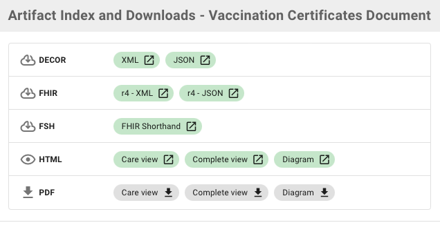
PDF generation
PDF creation is possible at several places in the frontend. There is now the just mentioned AID button ("Artifact Inspection and Download") that allows artifact visualization, download and also the new PDF creation feature where applicable. PDF creation is also available for larger contents.
Urgent News
For information, announcements and warnings, ART-DECOR Panels may show an Urgent News banner in the top area of the panel. The are colored top bars:
- blue for information
- orange for warnings and
- red for errors.

This is what it looks like on the Landing Page.
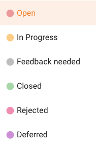
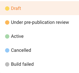
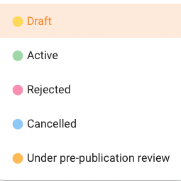
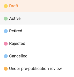
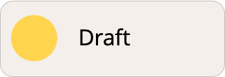
Status Colors
Use in User Interface
The use of status colors in a list or text.
Final
Status Code Matrix
Depending on the actual artifact, status codes can slightly be different. The reason is mostly for historical (backward) compatibility.
| Color | Items, such as Concepts, Value Sets, Scenarios | Code System | Template | Profile | Release | Issues |
|---|---|---|---|---|---|---|
| Open | ||||||
| Draft | Draft | Draft | Draft | Draft | In Progress | |
| Under pre-publication review | Pending | Under pre-publication review | ||||
| Final | Active | Active | Active | Active | Closed | |
| Rejected | Rejected | Rejected | Rejected | |||
| Deferred | ||||||
| New | New | Unknown | Build failed | Feedback needed | ||
| Retired/ Deprecated | Retired/ Deprecated | Retired/ Deprecated | Retired | |||
| Cancelled | Cancelled | Cancelled | Cancelled | |||
| Experimental |
Examples of Status Codes and State Transitions
EditableIssueStatusCode
EditableReleaseStatusCode
EditableTemplateStatusCode
EditableProfileStatusCode
Status Machines
Item Status
This status machine is for Datasets, Concepts, Scenarios, Transactions, Concept Associations, Value Sets, Code Systems and Instances. The corresponding definition structure is ItemStatusCodeLifeCycle.
| Status Code | Description | Transitions | Color |
|---|---|---|---|
| new | Item just created and is new and work in progress to become a draft/finalized item/issue. Beyond the author, nobody should look at this item/issue unless it's status code is draft or finalized. | (anywhere) | |
| draft | Item is draft | final, pending, rejected, cancelled | |
| final | Item finalized, has been published by the governance group (custodian organization) and deemed fit for use | deprecated | |
| pending | Item is in pre-publication review: the item is complete, pending appropriate review | final, rejected | |
| rejected | Item is rejected. During the development process of the item design (new, draft) it was decided that further development on this item will not happen. | ||
| cancelled | Item was never published and is withdrawn | ||
| deprecated | Item is deprecated, i.e. item should be avoided to be used, typically because it will be or has been superseded (retired) |
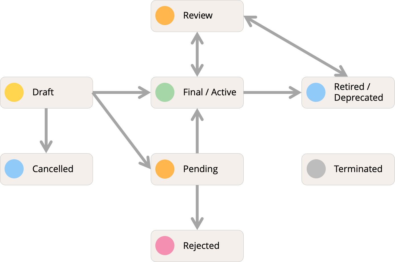
Templates, Profiles
This status machine is for Templates. The corresponding definition structure is TemplateStatusCodeLifeCycle. The status machine for FHIR profiles is a subset of the templates status machine: it supports draft, active and retired only, see FHIRProfileStatusCodeLifeCycle.
| Status Code | Description | Transitions | Color |
|---|---|---|---|
| draft | Template under development (nascent). Metadata and template may be incomplete. Entered primarily to encourage other users to be aware of ongoing process. | active, retired, rejected, cancelled, pending, review | |
| active | Template has been published by the governance group (custodian organization) and deemed fit for use. May have associated adoption and annotation metadata. | retired | |
| retired | Template retired: No longer fit for use. Information available for historical reference. | ||
| rejected | Template is rejected. During the development proces of a template design (new, draft) it was decided that further development on this template will not happen. | ||
| cancelled | Template was never published and is withdrawn. | ||
| pending | Template is in pre-publication review: the template is complete, pending appropriate review. Entered primarily to encourage other users to be aware of and/or participate in the review process. The governance group (custodian organization) has not given it an "active" status (i.e. it has not been published); and it may still be rejected (transitioned to an inactive status)., e.g. the template may be under ballot by an SDO. | active, retired, rejected, cancelled | |
| review | Template is in review: a post-publication state; may result in a new version or a retirement or no change at all. A new version is one that adds clarity but not new intent (new version date but identifier is unchanged). A retirement is a template that is no longer fit for purpose, and which may be replaced by a different a template (version), which is linked to the retired template. | active, retired |
Coded Concepts
This status machine is for Coded Concepts in Code Systems. A subset is also used for ART-DECOR's internal Published Stable Browsable Format. The corresponding definition structure is CodedConceptStatusCodeLifeCycle. Don't mix this status machine with the Code System status machine that is a Item Status.
| Status Code | Description | Transitions | Color |
|---|---|---|---|
| draft | Coded Concept under development (nascent). Properties may be incomplete. Entered primarily to encourage other users to be aware of ongoing process. | active, deprecated, retired, cancelled, rejected, experimental | |
| active | Coded Concept has been published by the governance group (custodian organization) and deemed fit for use. | deprecated | |
| deprecated | Coded Concept is deprecated, i.e. should be avoided to be used, typically because it will be or has been superseded | retired | |
| retired | Coded Concept retired: No longer fit for use. Information available for historical reference. | ||
| rejected | Coded Concept is rejected. During the development proces of a Coded Concept design (new, draft) it was decided that further development on this Coded Concept will not happen. | ||
| cancelled | Coded Concept was never published and is withdrawn. | ||
| experimental | Coded Concept is provided for trial, but may be removed in the future | active |
Issues
This status machine is for Issue/Tracking. The corresponding definition structure is IssueStatusCodeLifeCycle
| Status Code | Description | Transitions | Color |
|---|---|---|---|
| new | Issue just created. It is new and will soon become an open issue. Beyond the author, nobody should look at this issue unless it's status code is open or beyond open. | open | |
| open | Issue ready for actions to take on, also open for comments | open, inprogress, feedback, closed, rejected, deferred, cancelled | |
| inprogress | Issue is in progress | inprogress, feedback, closed, rejected, deferred, cancelled | |
| feedback | Issue is in progress but needs feedback from others | inprogress, feedback, closed, rejected, deferred, cancelled | |
| closed | Issue is closed including an solution | closed, inprogress, feedback, rejected, deferred, cancelled | |
| rejected | Issue is rejected | rejected, inprogress, feedback, closed, deferred, cancelled | |
| deferred | Issue is deferred | deferred, inprogress, feedback, closed, rejected, cancelled | |
| cancelled | Issue is cancelled | cancelled, inprogress |
Releases
This status machine is for Releases (publications) and History items. The corresponding definition structure is ReleaseStatusCodeLifeCycle.
| Status Code | Description | Transitions | Color |
|---|---|---|---|
| draft | Release under development (nascent). Entered primarily to encourage other users to be aware of ongoing process. | draft, pending, active, cancelled, failed | |
| pending | Release is in pre-publication review: the Release is complete, pending appropriate review. | pending, draft, active, cancelled, retired, failed | |
| active | Release has been published by the governance group (custodian organization) and deemed fit for use. May have associated adoption and annotation metadata. | active, retired | |
| retired | Release retired: No longer fit for use. Information available for historical reference. | retired | |
| cancelled | Release was never published as active and is withdrawn. | cancelled | |
| failed | Release build failed. | failed |
Single
Main Axis

Detail for Template
Example of Status Colors in Version Stepper

Core Data Bar for artifacts
Most artifacts are versionable and have typcial ART-DECOR attributes. These core attributes are often shown in the Core Data
Top Core Meta Data
Base for versionable objects. It is typically comprised of
- an identifer in short format (in fact it is an OID)
- a name or display name
- a status
- a version, in ART-DECOR this the effective date of creation
- a version label that assigns a human readble label to the version effective date

In some cases there is a little green chevron icon to the very right that offers opening a tab with more Meta Data of the artifact.
Description
tbd
Additional Meta Data
tbd
Version Stepper
artifacts that have versions typically show the Version Stepper as a first information of the Detail Panel.
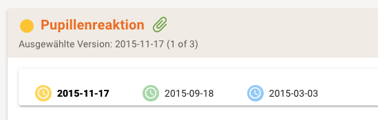
The Version Stepper Bar is a clickable list showing the Status Color of the version and the date. For orientation there is also an indication of the selected version right below the artifact name.
When clicking on a version in the Version Stepper Bar the details to that version are shown.
Associated Issues
tbd
Usage
tbd
History
tbd
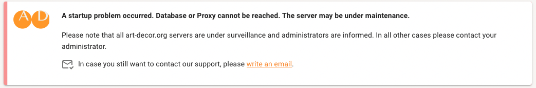
Startup Problems
A startup problem can occurr when the Database or Proxy cannot be reached or the server is under maintenance.
Please note that all art-decor.org servers are under surveillance and administrators are informed. In all other cases you should contact your administrator.
This hint will appear on startup problems.
Use of Colors
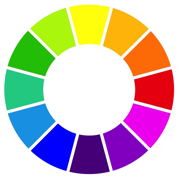
We were asked about the background of the colors, e.g. the logo, as for the ART-DECOR® Tool the main color is orange. In Sir Isaac Newton’s (1666) color wheel the light blue is the opposite of the orange we usually use (as the commercial branch is something like the opposite of the open source branch). There are multiple variants of the color wheels, the one to the right is after Liedl.
The dots come from the two dots of the trademarked ART-DECOR® logo. The dots are also used for the logo of the ART-DECOR Expert Group driving the development of the tool with the color orange.
Another nice story is the color of the buttons in the ART-DECOR tools suite. Green buttons indicate that no data will be changed but offers new views on data etc. Orange buttons though, do change data. That is why edit buttons for example are orange.
The core colors of interoperability
Also the three core areas of interoperability are reflected by the colors
green (Medical Domain Experts)
blue (Terminologists) and
orange (Technicians).